You don’t need a full remodel to make your place feel snug and stylish. The right color combo can cozy up a room faster than a chunky knit blanket. Let’s talk pairings that never miss—balanced, warm, and ridiculously livable. Grab your paint swatches; it’s about to get comfy.
1. Cream & Caramel: The Café au Lait Classic
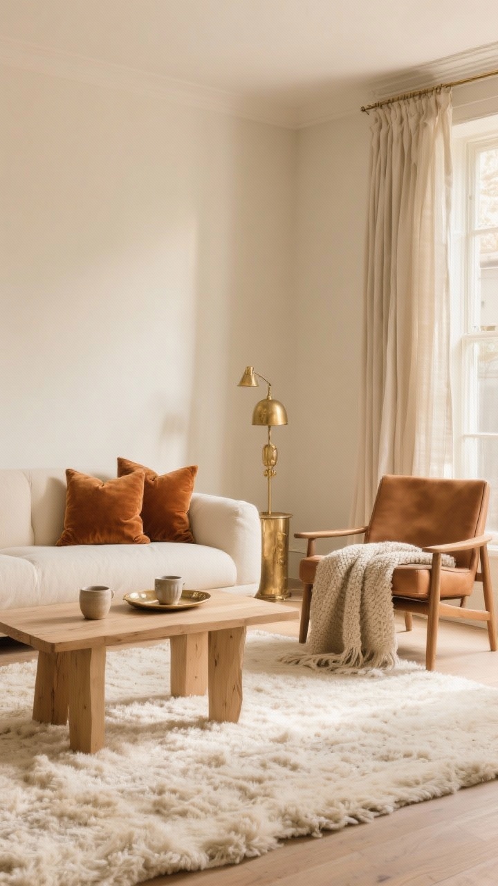
This is the latte of color combos—smooth, warm, and universally flattering. Cream softens while caramel adds depth, so your room feels layered, not flat. It’s perfect for living rooms, bedrooms, or anywhere you want a gentle glow.
Why It Works
- Low contrast = calm vibes. Your eye can relax, which instantly reads as cozy.
- Plays nice with textures. Linen, boucle, leather—everything looks richer.
Try This
- Walls in soft cream, caramel velvet pillows, and a light oak coffee table.
- Add a camel leather chair and a cream wool rug for luxe comfort.
- Metal accents: go brushed brass or antique gold.
2. Sage Green & Warm White: Nature’s Chill Pill
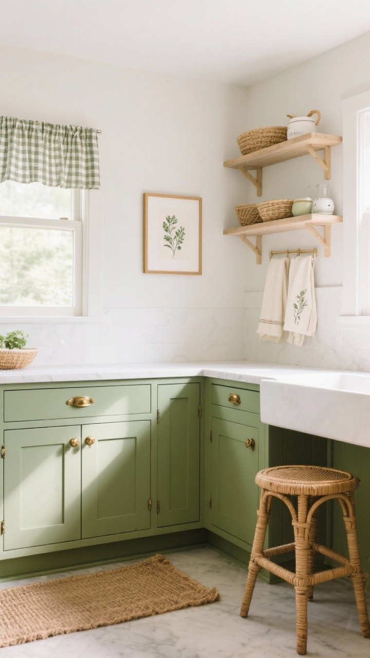
Sage is the plant whisperer of paint colors—grounding without going full forest. Pair it with warm white for a clean, airy feeling that still reads cozy. Great for kitchens, bedrooms, or anywhere you want zen without the yawn.
Why It Works
- Biophilic undertones. Green calms because, well, nature.
- Warm white keeps it fresh. Avoid stark whites—they can feel cold.
Try This
- Cabinets in sage, walls in warm white, and aged brass hardware.
- Layer natural fibers: jute, rattan, and creamy cotton.
- For pattern, use botanical prints or subtle gingham.
3. Terracotta & Soft Blush: Sun-Soaked and Snug
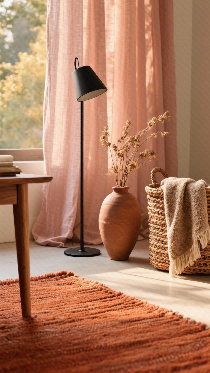
Earthy terracotta brings warmth; blush lightens it up so the room doesn’t feel heavy. It’s like a sunset, but in your living room. Romantic without being fussy—IMO, this pairing is criminally underrated.
Why It Works
- Warm-on-warm harmony. The tones share a base, so they blend beautifully.
- Depth without darkness. Blush keeps things bright.
Try This
- Terracotta accent wall or rug, blush linen curtains, and warm wood furniture.
- Mix in matte black for a little edge—think frames or a floor lamp.
- Textiles: nubby throws, clay vases, and woven baskets.
4. Navy & Camel: Tailored But Cozy
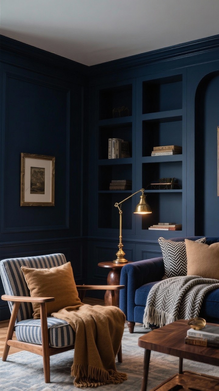
Think “cashmere coat meets moody library.” Navy gives structure; camel adds warmth and softness. This combo is amazing for offices, dens, and bedrooms where you want refined comfort.
Why It Works
- High contrast, low chaos. Navy anchors the room; camel rounds it out.
- Timeless and a little luxe. It feels expensive even when it isn’t—FYI.
Try This
- Navy walls or sofa, camel throw blankets, and natural wood tones.
- Layer pinstripes or herringbone for that tailored vibe.
- Metal accents: antique brass or oil-rubbed bronze.
5. Charcoal & Dusty Rose: Moody Meets Soft
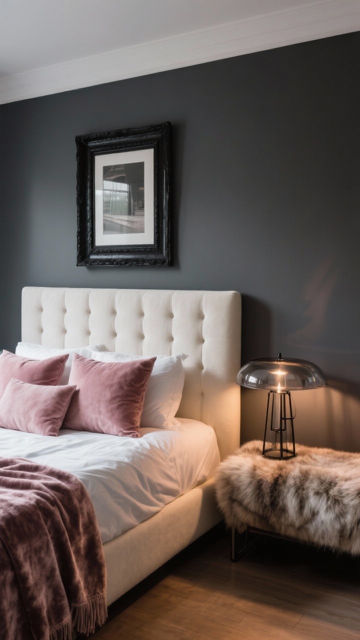
For those who like a little drama, charcoal adds mood while dusty rose softens the edges. The result? A cocoon that’s chic, not cave-like. Great for bedrooms or living rooms where you’re aiming for cozy-but-modern.
Why It Works
- Cool base, warm accent. The temperature contrast keeps it interesting.
- Rose = glow. It reflects flattering light (your selfies will thank you).
Try This
- Charcoal walls or rug, dusty rose pillows, and cream upholstery to lift the palette.
- Add smoked glass or black metal for a modern edge.
- Go heavy on soft textures: velvet, chenille, and faux fur.
6. Mushroom Taupe & Soft Black: Quiet Luxury, Home Edition
Mushroom taupe is the neutral of neutrals—earthy, elegant, and endlessly flexible. Pair it with soft black (think charcoal-black, not jet) for definition. It’s minimalist but warm, perfect if you’re allergic to clutter and neon.
Why It Works
- Subtle contrast. The soft black outlines the space without shouting.
- Layering-friendly. Everything from wood to stone to linen looks at home here.
Try This
- Taupe walls, soft black doors or window trim, and cream upholstery.
- Stoneware lamps, unlacquered brass hardware, and boucle pillows.
- Keep patterns low-key: tweeds, micro-checks, or tone-on-tone stripes.
7. Mustard & Olive: Cozy Vintage With Modern Energy
Don’t be scared—this combo is a vibe. Mustard brings cheer; olive grounds it so you don’t feel like you live in a school bus. It’s cozy, earthy, and slightly retro in the best way.
Why It Works
- Both are warm, but complementary. The green reins in the yellow, creating balance.
- Excellent for layering patterns. Florals, plaids, and block prints love this palette.
Try This
- Olive sofa or curtains, mustard throw pillows, and warm walnut furniture.
- Sprinkle in cream to keep things from feeling heavy.
- Accent with aged brass or burnished copper for glow.
Quick Tips For Making Any Cozy Combo Work
- Mind the temperature. Warm whites with warm tones; cool whites with cool tones.
- Test in real light. Swatch paint on multiple walls and check morning, noon, and night.
- Anchor with a rug. Your rug should tie at least two palette colors together.
- Use the 60/30/10 rule. 60% main color, 30% secondary, 10% accent. Easy. Foolproof.
- Texture is everything. Even a neutral palette feels rich with varied weaves and finishes.
Where To Add The Color (Without Panic)
- Walls: Best for softer shades (cream, taupe, sage).
- Upholstery: Go mid-tone and stain-friendly (olive, camel, navy).
- Accents: Throw pillows, lampshades, art—great for your bolder hues (mustard, terracotta, blush).
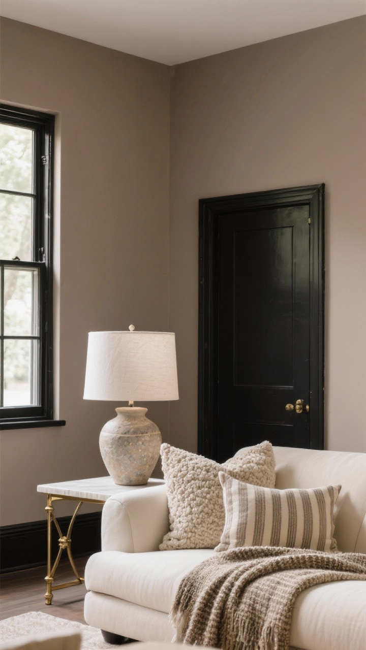
- Trim & Doors: Soft black or deep navy equals instant custom look.
Bottom line: cozy color is about balance—warmth, contrast, and texture playing nicely together. Pick one of these seven combos, layer your textures, and add a few glowy lamps. Your space will feel like a hug, minus the awkward pat on the back.
Explore My Favorite Finds
Discover beautiful home pieces, cozy essentials, and elegant decor I personally love — all in one place.
Visit My ShopDiscover free printable activities, coloring pages, and learning fun screen-free and perfect for cozy days at home.
Visit FreeKidsHub →Explore More & Elevate Your Home
If you’re dreaming of stylish rooms, warm textures and beautiful details that transform your space, explore our Home Décor.
For soft evenings, slow routines and a home that feels like a warm hug, discover more ideas in Cozy Living.
If you’re ready for less chaos and more calm, find realistic routines and tidy-home solutions inside Organization.
For soft-life habits and everyday routines that feel good, visit our Home Lifestyle.
When you’re in the mood for glow-up projects and creative home upgrades, explore DIY & Makeovers.
And if you want your balcony, terrace or garden to feel just as cozy as your indoors, get inspired in Outdoor Living.