
Neutrals can look stunning—calm, chic, timeless. They can also look flat, boring, or like a landlord’s special if you miss a few key moves. The good news? A few simple tweaks can take your beige-on-beige from blah to breathtaking. Let’s skip the guesswork and nail the look you actually wanted.
1. Treating “Neutral” As One Color
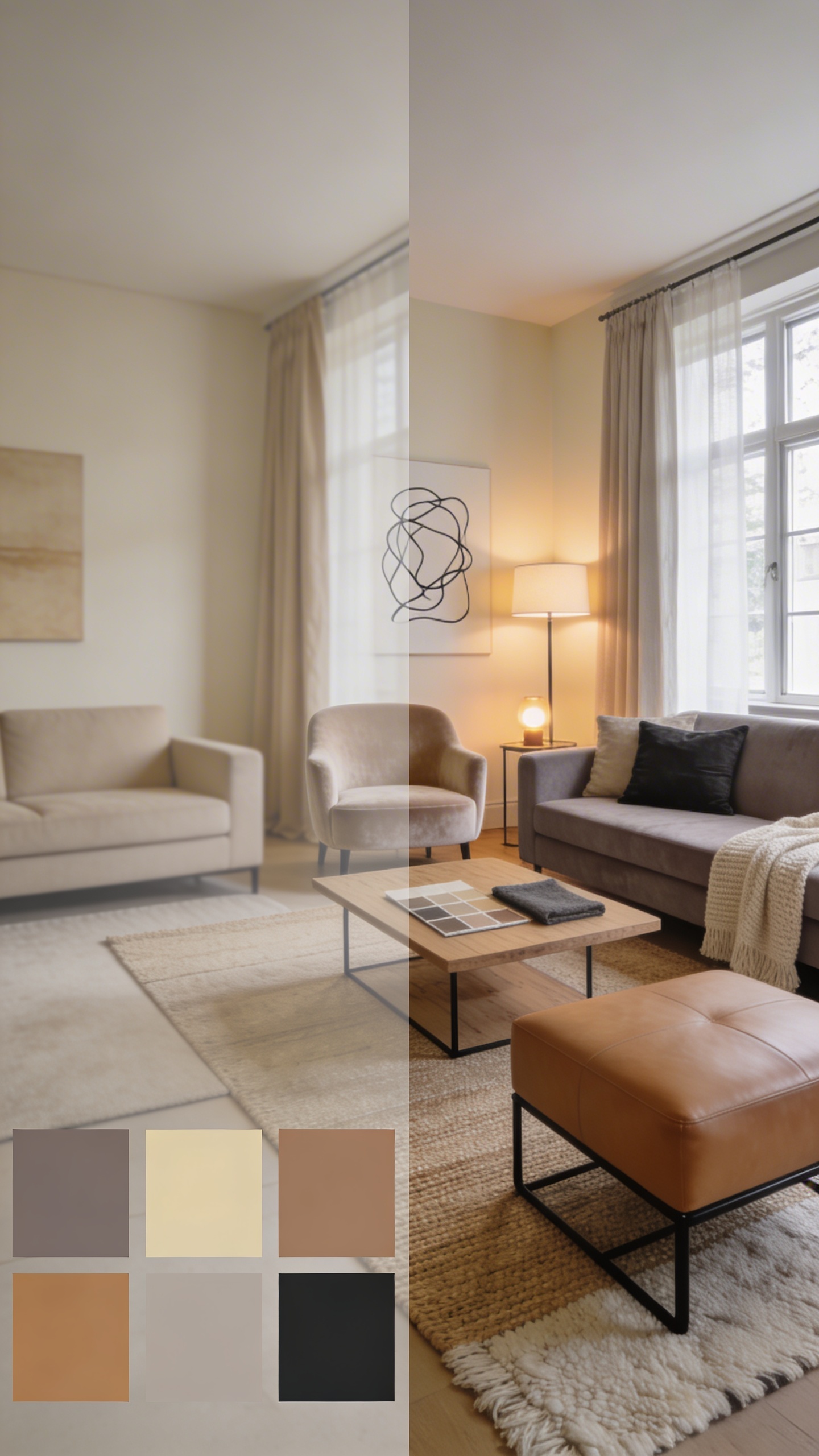
Beige is not a personality. Neither is “greige.” When you stick to a single neutral without variation, everything blends into one forgettable blur.
What To Do Instead
- Mix undertones: cool taupes with warm creams, soft mushroom with camel, oatmeal with charcoal.
- Vary the depth: light walls, medium furnishings, darker accents for balance.
- Sample in daylight and at night to catch undertone shifts you’ll only notice when it’s too late.
Play in a family of neutrals, not just one shade. The contrast makes your space feel layered and alive.
2. Forgetting Texture (AKA The Fast Track To Flat)
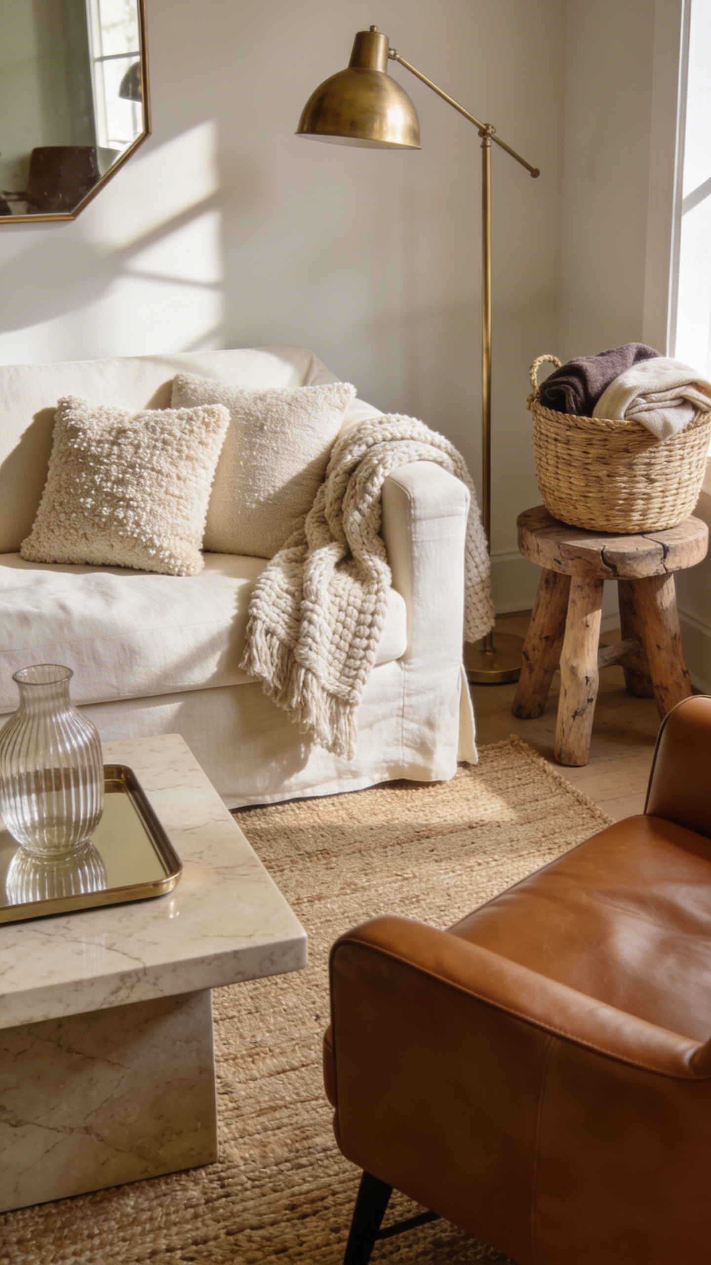
Neutrals need texture like plants need sunlight. Without it, even expensive rooms feel cheap and unfinished.
Texture Toolkit
- Soft + nubby: bouclé pillows, chunky knit throws, linen slipcovers
- Smooth + sleek: leather chairs, lacquer trays, polished stone
- Organic: jute rugs, woven baskets, raw wood stools
- Light-catching: brushed brass lamps, mirrored accents, ribbed glass
Mix at least three distinct textures in any seating area. Result: depth, warmth, and that “designer did this” vibe—seriously.
3. Ignoring Undertones (Your Silent Saboteur)
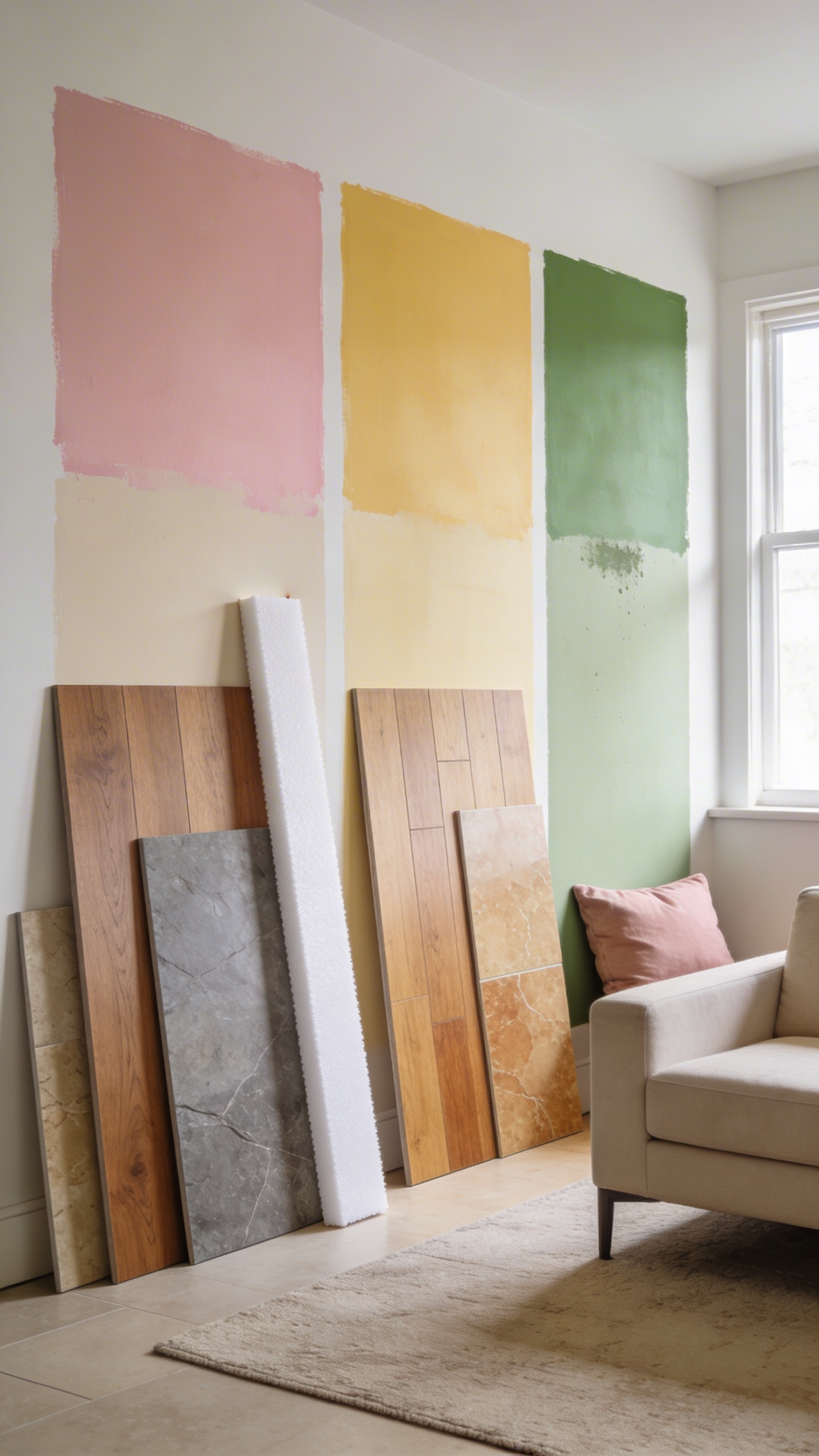
Two “beiges” can fight like siblings if their undertones clash. Pink-beige next to green-beige? Yikes. Your eye reads it as dirty or mismatched even if you can’t pinpoint why.
How To Read Undertones
- Compare, don’t isolate: line up samples against true white to spot hidden pink, yellow, or green.
- Check with existing finishes: flooring, countertops, and tile often dictate which undertones work.
- Use large samples: paint at least a 2’ x 2’ swatch on multiple walls.
Honor undertones and everything feels cohesive. Ignore them and you’ll chase fixes forever, FYI.
4. Playing It Too Safe With Zero Contrast
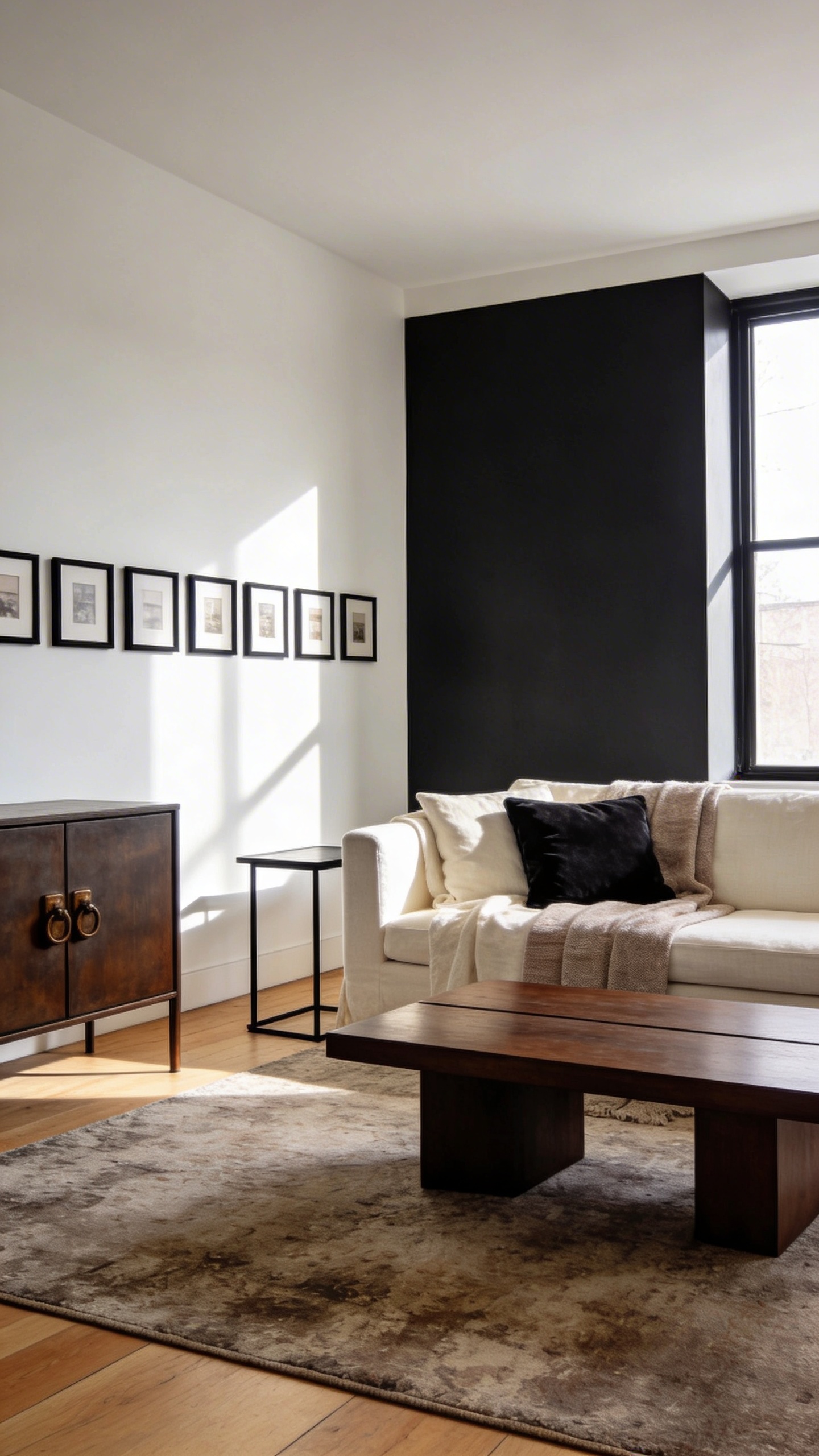
All light neutrals with no contrast equals visual oatmeal. Cozy? Maybe. Memorable? Not at all. You need light, medium, and dark tones to create rhythm.
Easy Contrast Wins
- Anchor with a dark element: charcoal velvet pillow, espresso-stained wood, oil-rubbed bronze hardware.
- Define edges: darker side tables or a black picture frame lineup to outline the space.
- Add a moody moment: one deep wall, a smoky rug, or a dark-stained coffee table.
Contrast adds dimension and keeps neutral rooms from feeling like a waiting room. Use it to guide the eye and ground the space.
5. Skipping Pattern Because “It’s Neutral, It’ll Match”
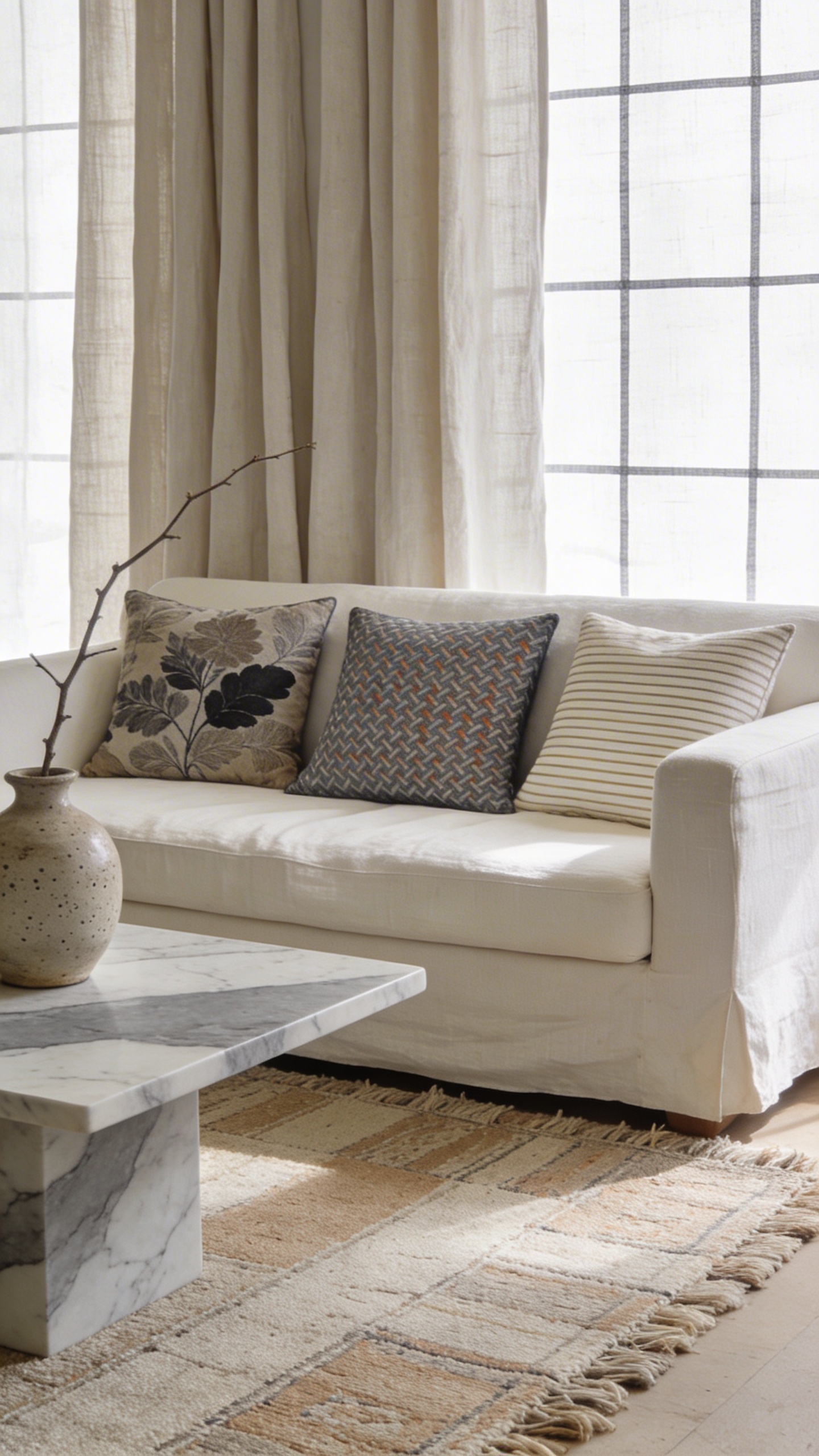
Neutral doesn’t mean pattern-free. Without pattern, your room lacks movement and personality. Patterns in subtle palettes keep things calm but not sleepy.
Patterns That Play Nice
- Organic: marble veining, stoneware speckle, botanical prints in taupe or charcoal
- Geometrics: pinstripes, herringbone, small-scale checks, windowpane
- Global-inspired: kilim, mudcloth, or dhurrie motifs in low-contrast tones
Combine one organic, one geometric, and one subtle stripe. Keep scales varied so they don’t compete. The payoff? Movement without chaos.
6. Forgetting Warmth From Wood And Natural Materials
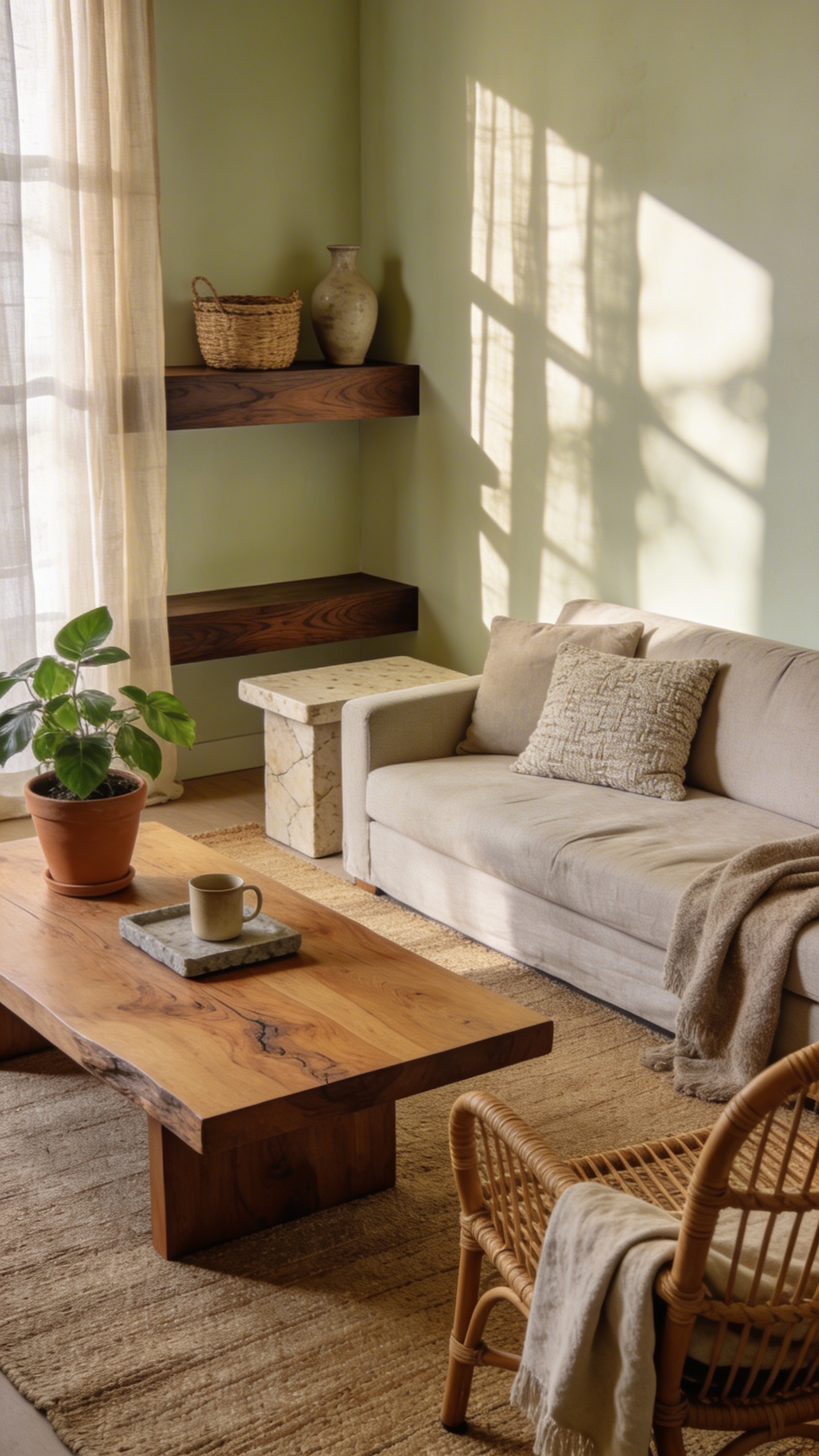
Neutrals can veer cold if you skip organic elements. Wood, stone, rattan, and linen pull in warmth and make spaces feel human again.
Bring In The Earthy Stuff
- Wood tones: oak, walnut, or elm—aim for one dominant and one supporting tone.
- Natural fibers: jute or sisal rugs for grit, wool for softness.
- Stone and clay: travertine side table, terracotta planter, soapstone tray.
When in doubt, add a wood accent and a woven piece. Instantly cozier, more livable, and IMO, more interesting.
7. Neglecting Lighting Layers (And Wondering Why It Feels Blah)
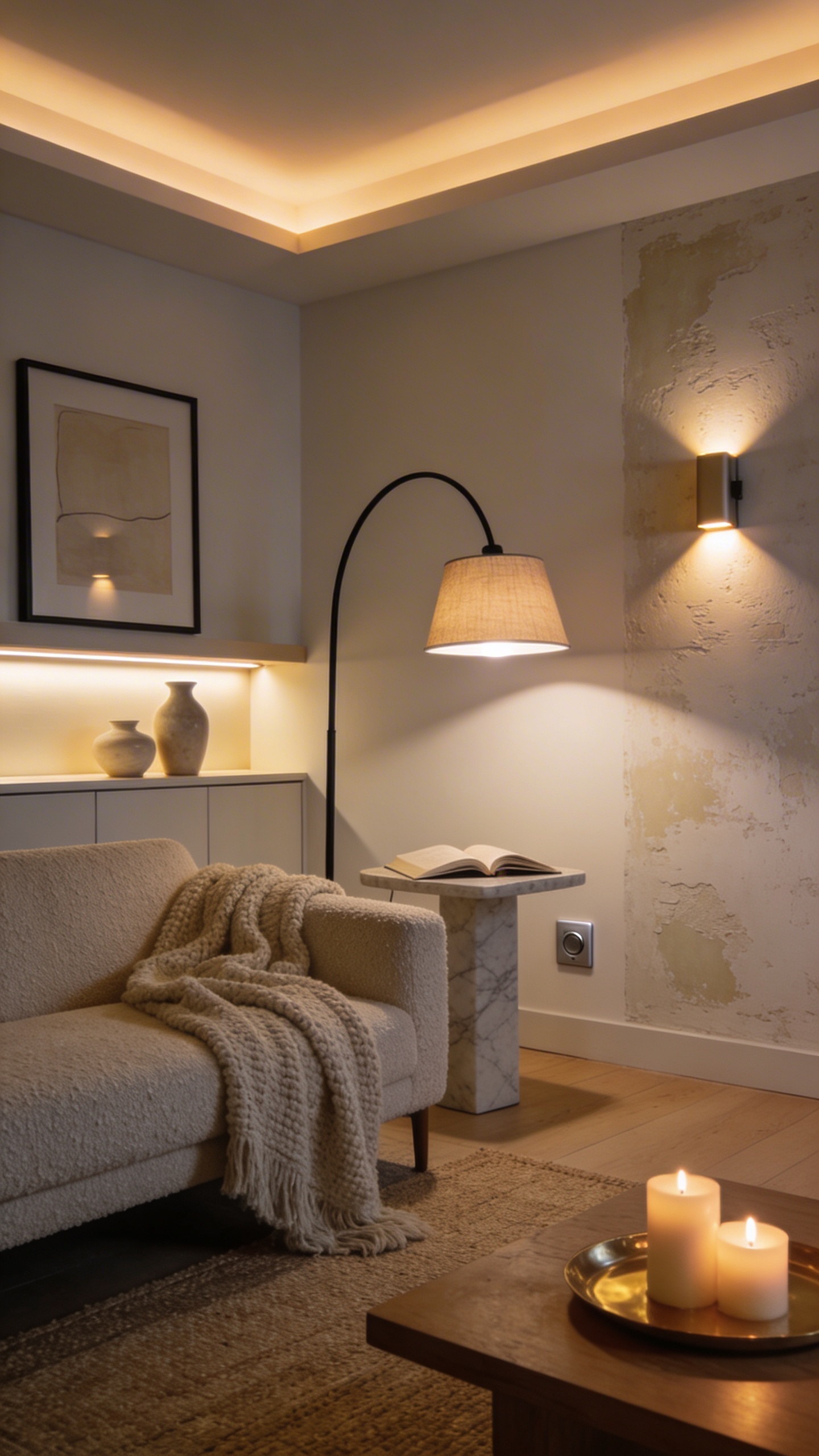
Lighting makes or breaks neutral decor. One overhead light washes everything out and kills texture. Layer lighting to add shape, shadow, and mood.
Layered Lighting 101
- Ambient: soft overhead or cove lighting that sets the base glow.
- Task: reading lamps, under-cabinet strips, picture lights for function and focus.
- Accent: wall washers, sconces, or candles to sculpt texture and art.
Use warm bulbs (2700K–3000K) to flatter neutrals. Dimmer switches? Non-negotiable. You’ll actually see the textures and undertones you worked so hard to pick—trust me.
Ready to make your neutrals sing? Mix undertones thoughtfully, layer texture like it’s your job, and let lighting do the heavy lifting. Keep contrast, pattern, and natural materials in the mix, and your space will feel calm, polished, and never, ever boring.
Explore More & Elevate Your Home
If you’re dreaming of stylish rooms, warm textures and beautiful details that transform your space, explore our Home Décor.
For soft evenings, slow routines and a home that feels like a warm hug, discover more ideas in Cozy Living.
If you’re ready for less chaos and more calm, find realistic routines and tidy-home solutions inside Organization.
For soft-life habits and everyday routines that feel good, visit our Home Lifestyle.
When you’re in the mood for glow-up projects and creative home upgrades, explore DIY & Makeovers.
And if you want your balcony, terrace or garden to feel just as cozy as your indoors, get inspired in Outdoor Living.