Your home doesn’t have to look like a showroom, but it also doesn’t need “I gave up” energy. The sneaky truth? A lot of spaces look messy not because they’re dirty, but because of a few fixable decor choices. Let’s clean that up—visually and literally—without buying a whole new house. Ready?
1. The “Too Small Rug” Disaster
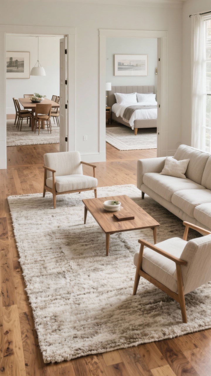
Nothing shrinks a room faster than a postage stamp rug floating in the middle. If your sofa legs are dangling off like they’re afraid of commitment, that rug is too tiny. It makes everything feel random and—yep—messy.
Fix It: Size Up and Anchor
- Living room: Front legs of sofas and chairs should sit on the rug. Aim for 8×10 or 9×12 in most spaces.
- Dining room: Chairs should stay on the rug even when pulled out. Add 24 inches beyond the table on all sides.
- Bedroom: Rug should extend at least 18–24 inches beyond the sides/foot of the bed.
Big rug = instant polish. Your room will feel cohesive instead of chaotic.
2. Random Lighting That Makes Everything Look Blah
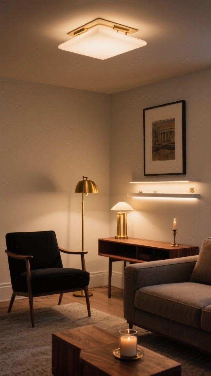
Overhead “boob lights,” we see you. Relying on one harsh ceiling light makes shadows weird and surfaces dull. That uneven lighting screams clutter even when your space is clean.
Fix It: Layer Your Light
- Ambient: Ceiling fixture or track lighting for overall glow.
- Task: Table lamps, floor lamps, sconces for reading and work zones.
- Accent: Picture lights, LED strips, candles for mood.
Use warm bulbs (2700–3000K) and dimmers. Lighting is makeup for your room—blend it.
3. Art Hung Like It’s Trying To Escape
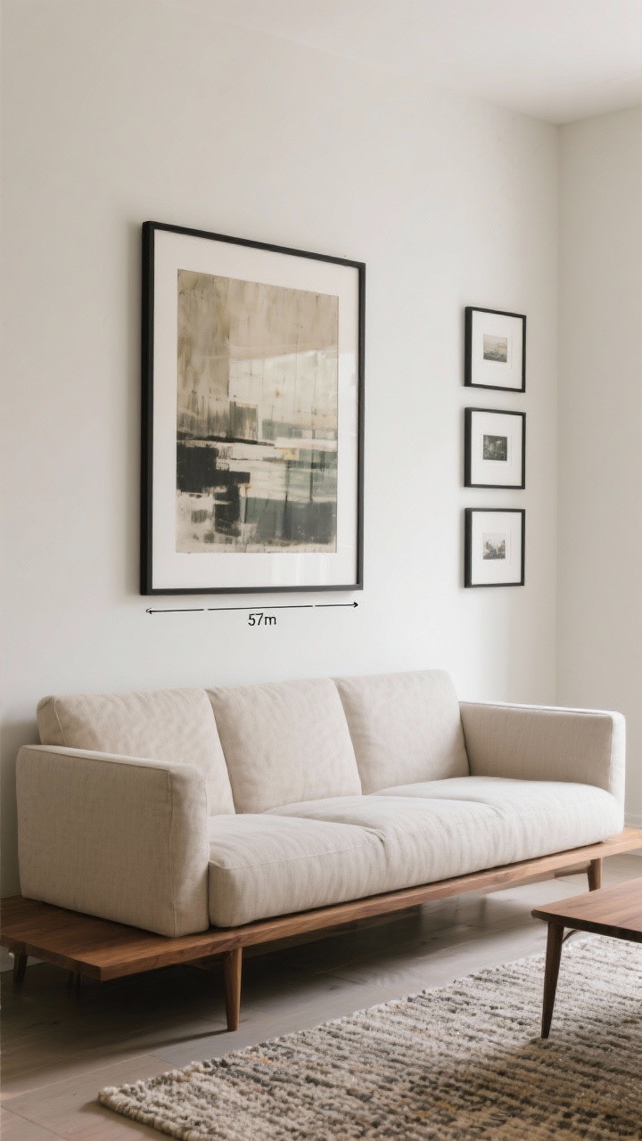
Art that’s hung too high looks like it’s floating away from your furniture. It separates visually and creates empty zones that feel sloppy.
Fix It: Lower It, Group It, Ground It
- Height rule: Center of artwork at ~57 inches from the floor (museum standard).
- Above furniture: Hang 6–8 inches above the top of the piece (sofa, console, headboard).
- Gallery walls: Keep 2–3 inch spacing between frames and align the center with that 57-inch line.
When art connects to the furniture, the whole room reads as one thoughtful decision—not chaos.
4. Too Many Tiny Things (Visual Clutter Overload)
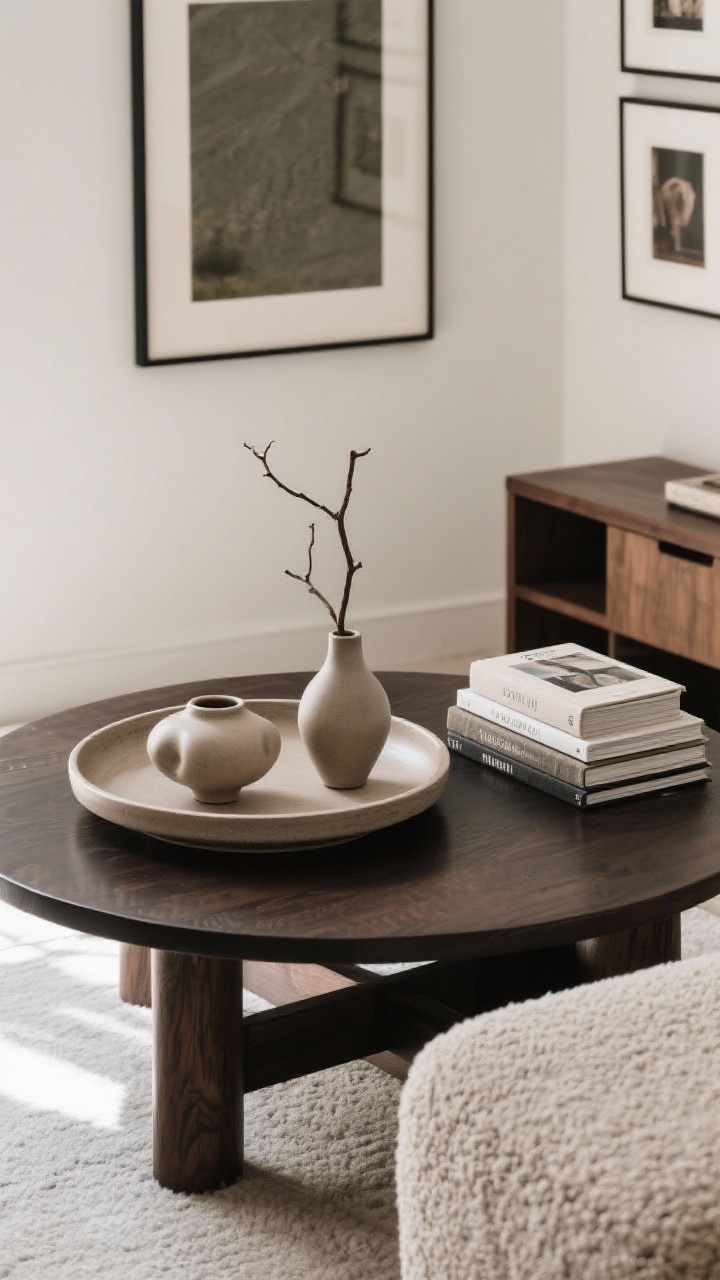
Little objects everywhere—trinkets, coasters, candles, more candles—turn surfaces into noise. Your eye doesn’t know where to land, so everything looks messy, even if it’s dust-free.
Fix It: Edit and Group
- Use trays: Corral small items into one visual unit on coffee tables and consoles.
- Rule of three: Group 3 items of varying height and texture—think vase + book stack + sculptural object.
- Scale matters: Swap five tiny frames for one statement piece or a cohesive gallery set.
Editing isn’t boring—it’s how you make your showstopper pieces actually shine.
5. Storage That Almost Works (But Doesn’t)
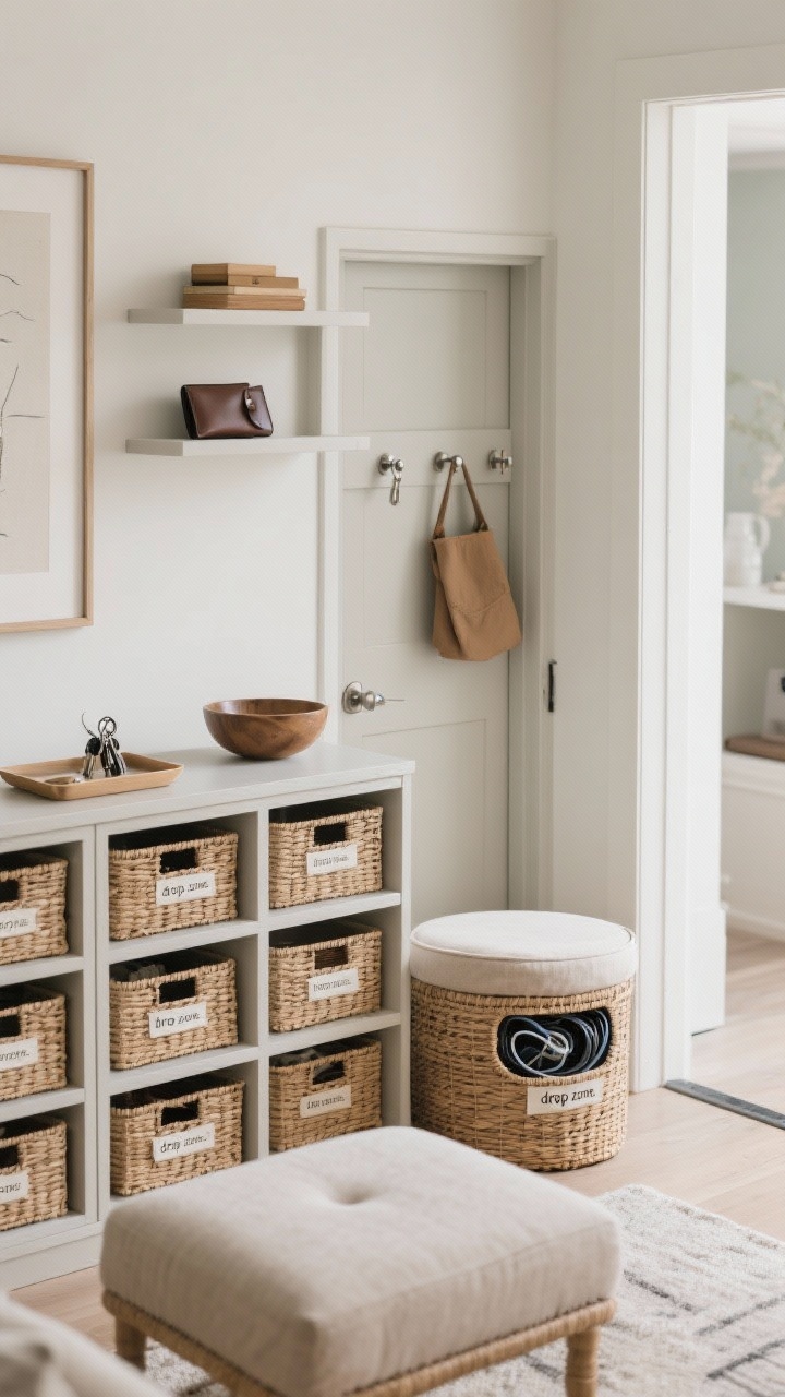
Open shelves overflowing with stuff? Baskets that don’t hide cords? That’s not storage; that’s decor performing a panic attack. Visual mess = mental mess.
Fix It: Hide, Label, Repeat
- Closed storage: Use cabinets, lidded baskets, or storage ottomans for anything not pretty.
- Contain categories: One bin per type: tech, kids’ toys, mail, pet supplies. Label discreetly.
- “Drop zone” discipline: Add a tray or bowl by the entry for keys/wallets so they don’t colonize the counters.
Open shelves should be styled like a magazine, not a garage sale. Tuck the rest behind doors—no shame.
6. Flat, Matchy-Matchy Textures
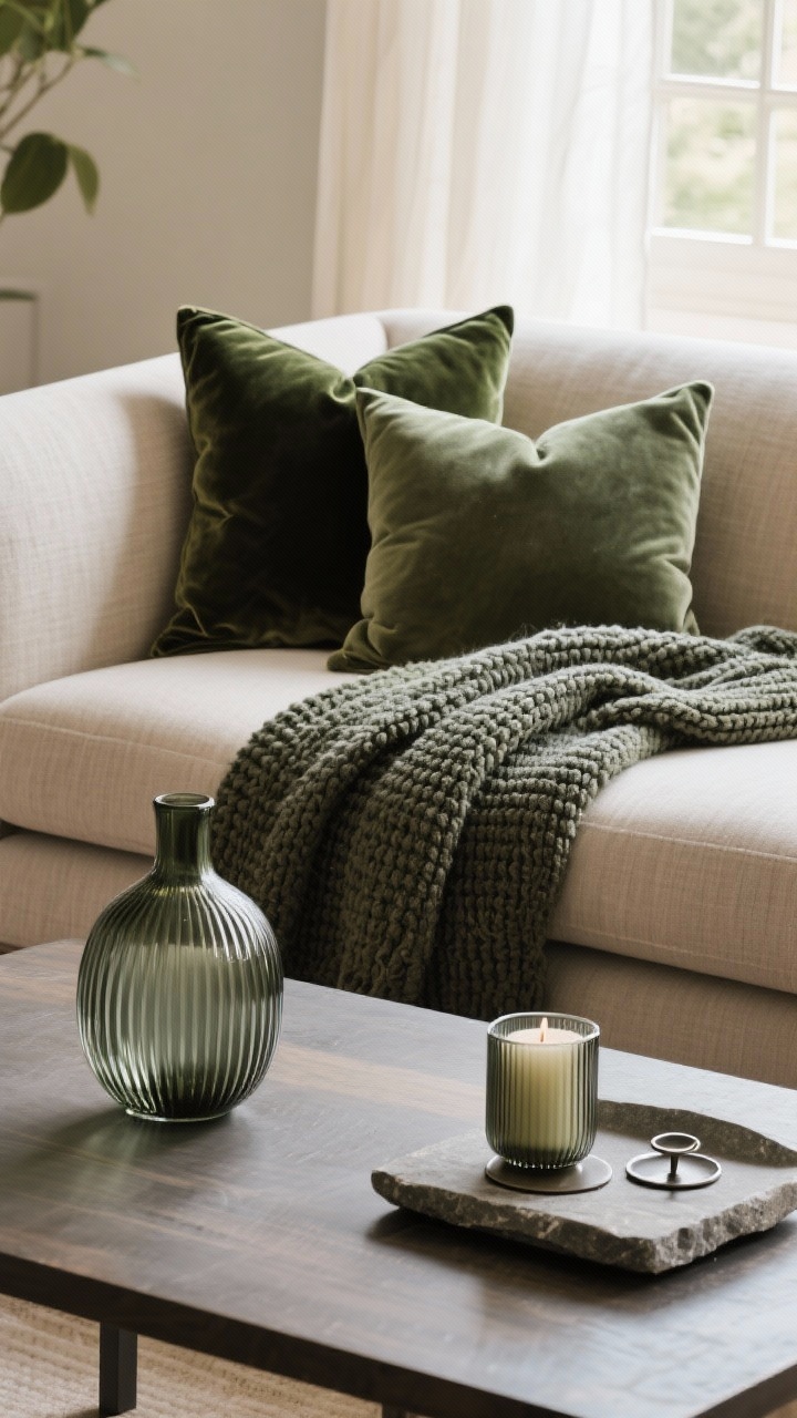
Everything smooth and sleek? Or all fuzzy all the time? That one-note texture makes a room feel lifeless and, weirdly, unkempt. It’s like wearing all one fabric—no depth.
Fix It: Layer, But With Intention
- Mix materials: Linen + velvet + wood + metal + stone = dynamic but calm.
- Contrast scale: Pair chunky knits with smooth ceramics; ribbed glass with matte wood.
- Repeat textures: Echo a material 2–3 times in the room so it looks cohesive, not random.
Texture is the secret sauce that makes a space feel styled—not just furnished.
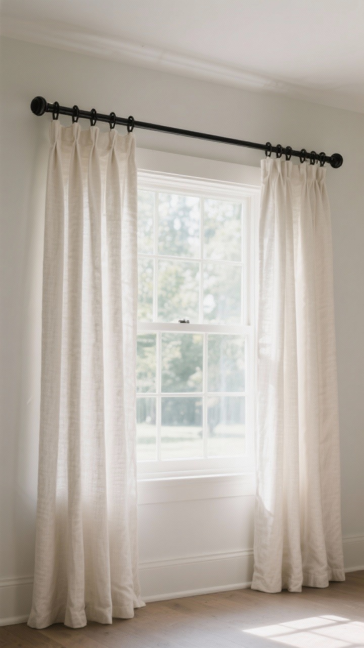
7. Curtains That Are Short or Skinny
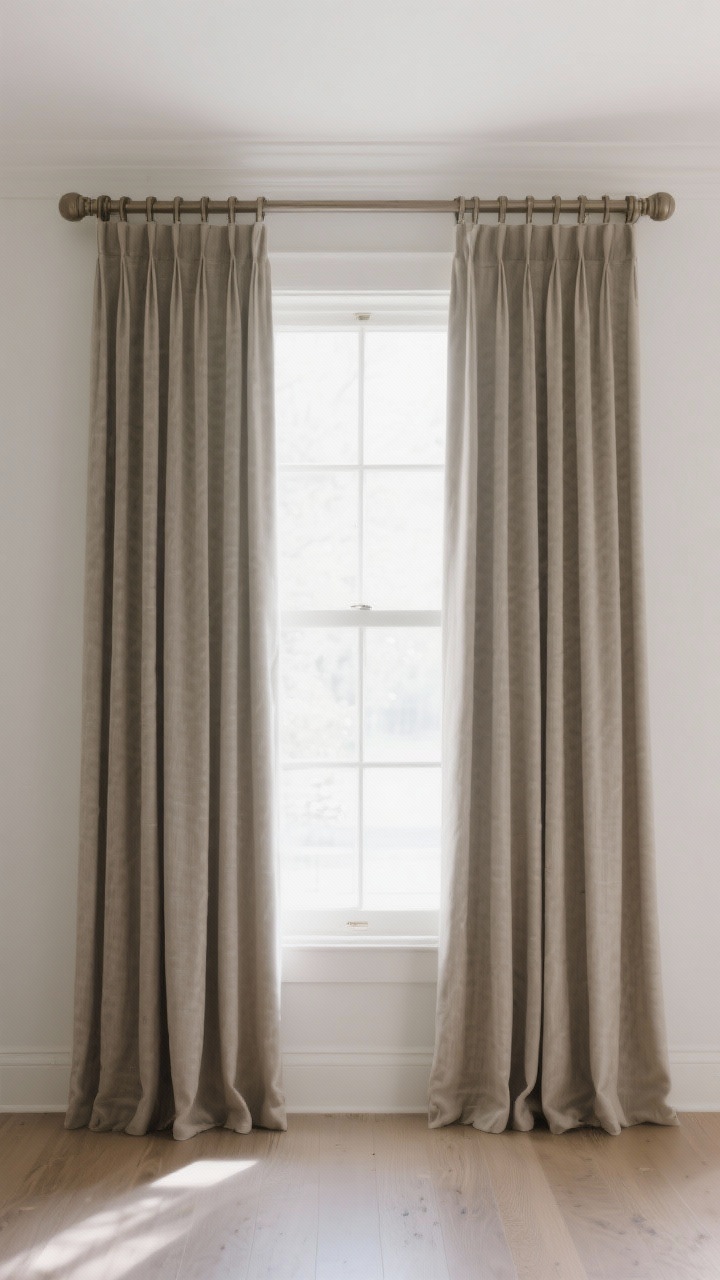
High-water drapes make your room look unfinished and a little sad. Skinny rods or panels that barely cover the window? Same problem. Your windows deserve better.
Fix It: Go High, Go Wide, Go Long
- Hang high: Mount rods 4–6 inches above the window (or just below the ceiling) to lift the eye.
- Extend wide: Rods should extend 8–12 inches past the window on each side so panels frame, not block, light.
- Puddle vs. kiss: Panels should “kiss” the floor or break slightly—never hover.
- Fullness: Total panel width should be 2x–2.5x the window width for luxe fullness.
Proper drapery = instant architecture. It’s the tailor-made suit of your room.
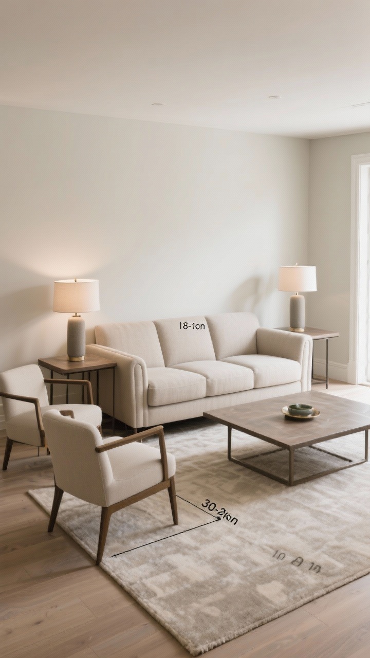
8. Ignoring Scale With Furniture
Tiny sofa, giant coffee table. Or massive sectional in a small living room. When scale is off, the room looks messy because nothing visually lines up.
Fix It: Measure Like You Mean It
- Mapping: Tape out pieces on the floor before buying. Walk around them to test clearances.
- Breathing room: Leave 18 inches between sofa and coffee table; 30–36 inches for main walkways.
- Balance height: Side tables should be within 2 inches of sofa arm height; lamps ~1.5x the height of their base.
When proportions agree, your room instantly looks tidier and more expensive. Magic? No—math.
9. Style Without a Color Plan
Five accent colors fighting for attention will always read as clutter. Even neutral chaos is a thing if undertones clash—cool gray next to warm beige can look muddy fast.
Fix It: Build a Palette and Stick To It
- Pick 3–5 colors: One dominant, one secondary, and 2–3 accents. Repeat them across rooms for flow.
- Watch undertones: Keep warms with warms (creams, taupes, brass) and cools with cools (grays, blues, chrome).
- Large items neutral: Sofa/rug in timeless tones; use pillows, art, and flowers for seasonal color swaps.
Consistent color is the fastest path from “cluttered” to “curated,” IMO.
10. Surfaces That Become Dumping Grounds
Counters covered in mail, island full of backpacks, nightstand stacked with “current reads” from 2019—relatable, but chaotic. The messiest-looking rooms often just need better habits and a few smart tools.
Fix It: Create Homes for Things
- Entry: Hooks for bags, tray for mail, lidded basket for scarves/hats. Add a bench to encourage “drop and store,” not “drop and run.”
- Kitchen: Vertical file for mail/menus, utensil crocks, and a “charging drawer” to hide cords.
- Bedroom: Nightstand with a drawer; cord clips; a small dish for jewelry and earplugs.
- 5-minute reset: Set a nightly timer. Surfaces cleared, brain cleared. FYI, it’s wildly satisfying.
It’s not about perfection. It’s about reducing friction so clutter has nowhere to land.
Bonus Micro-Tweaks That Make a Big Difference
- Pillow discipline: Fluff, chop (if that’s your vibe), and don’t overdo the count. Two large + one lumbar beats five randoms.
- Cord control: Adhesive clips, cable sleeves, and power strips mounted under consoles keep tech from stealing the show.
- Greenery: One substantial plant looks cleaner than six tiny ones scattered everywhere.
- Bookshelf styling: Alternate vertical and horizontal stacks, insert negative space, and repeat colors for rhythm.
Room-by-Room Quick Checks
- Living Room: Is the rug big enough? Are there at least three light sources? Are cords hidden?
- Bedroom: Do curtains kiss the floor? Is there concealed storage for overflow? Is art hung at the right height?
- Kitchen: Are everyday items decanted or corralled? Is there a system for mail/keys? Counter appliances edited?
- Bathroom: Matching containers/towels? Hooks vs. towel bars for actual humans? Back-of-door storage used?
Shopping Smart (So You Don’t Recreate the Chaos)
- Measure first: Keep your room’s key dimensions in your phone notes. Always.
- Buy in pairs: Matching lamps or side tables bring symmetry, which reads cleaner.
- Think “set” not “one-off”: Choose items that echo a material/color you already have so new additions feel intentional.
- Return ruthlessly: If it doesn’t improve function or cohesion, back it goes. No guilt.
Mindset Shift: Edit > Add
The biggest difference between styled and messy spaces? Editing. You probably need to remove 10–20% of what’s in the room. Then style what’s left with breathing room. Your eyes will exhale.
Here’s your permission slip to simplify. Keep what you love, scale up where it counts (rugs, curtains, lighting), and give everything a proper home. Your space will look cleaner, calmer, and more expensive—without a full makeover. You’ve got this.
Explore My Favorite Finds
Discover beautiful home pieces, cozy essentials, and elegant decor I personally love — all in one place.
Visit My ShopExplore More & Elevate Your Home
If you’re dreaming of stylish rooms, warm textures and beautiful details that transform your space, explore our Home Décor.
For soft evenings, slow routines and a home that feels like a warm hug, discover more ideas in Cozy Living.
If you’re ready for less chaos and more calm, find realistic routines and tidy-home solutions inside Organization.
For soft-life habits and everyday routines that feel good, visit our Home Lifestyle.
When you’re in the mood for glow-up projects and creative home upgrades, explore DIY & Makeovers.
And if you want your balcony, terrace or garden to feel just as cozy as your indoors, get inspired in Outdoor Living.